Finding Your Next Race
- Category: Printed Thematic Map
- Project date: 2021 Spring
- Course Information: Geog 370
- Award Information: 49th Annual CaGIS Map Design Competition
- Competition Map Galleries: 2021 Map Design Competition Galleries
Project Details
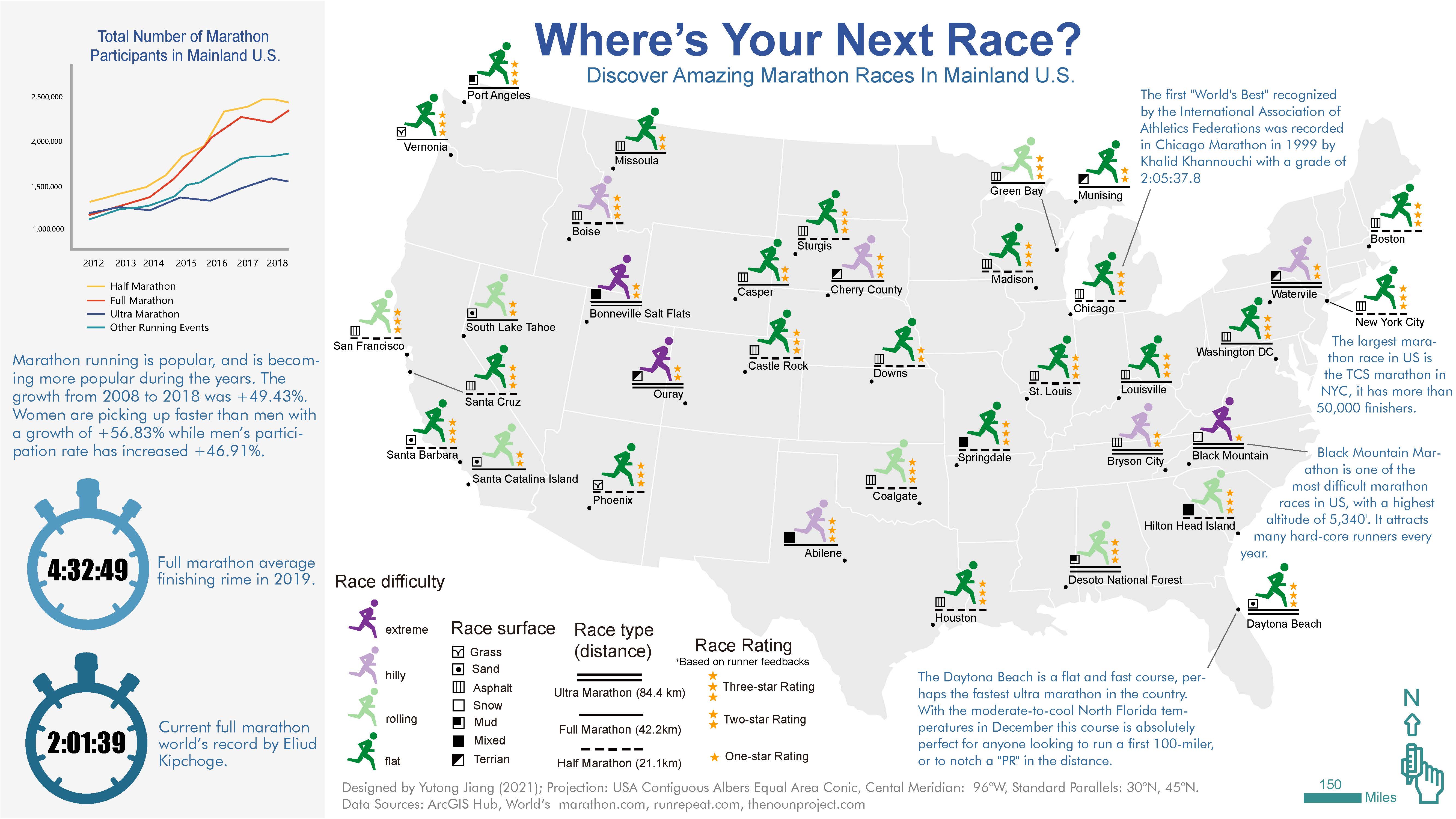
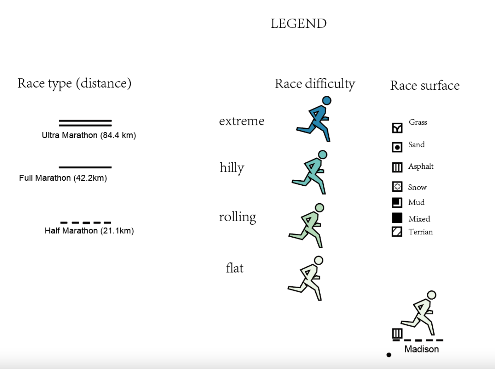
In the legend of thie map, I choose to : the color of the running person logo represent the race difficulty: the bluer the color, the more difficult the race is; the distance of the race is represented by the underline beneath the cartoon running person: two solid lines means ultra-marathon, which is double the distance of a normal/full marathon. And a dashed line represent a half marathon. Also, I choose to use a little cube symbol to represent the race surface to make the person looks like is running on that surface (though I try to keep it small and not occupying too much spaces) every race surface is represented by one little cube symbol. For example, the most popular race in Madison is a half marathon, with flat difficulty, and the race surface is asphalt; as a result, the symbol for Madison looks like this.